Brian LobsingerCreative Strategy's Key Ingredients

Brian Lobsinger, our senior director of creative strategy, boasts a career spanning every corner of the visual space in marketing and communication. From pre-press production in a print shop to advertising and marketing to software UX design and web development, he has experience aplenty­—more than 40 years’ worth.

Yet, no matter how technology evolves, no matter which tactics and techniques come and go, he’s quick to tell you the principles of an effective creative strategy remain the same regardless of the medium or complexity of the project.

Two that jump out right away: knowing the audience and consistency.

It’s those fundamentals Brian uses to steer the creative development at A. Bright Idea. We’re lucky that we get to talk to him daily. We want to share some of his insights you might find interesting.

Brian, thanks for taking the time to chat.
Of course, happy to take a quick break.

You’ve been around. You’ve held many roles in the creative and branding space. So, let’s start with what you think are the main elements of creative strategy and brand development.
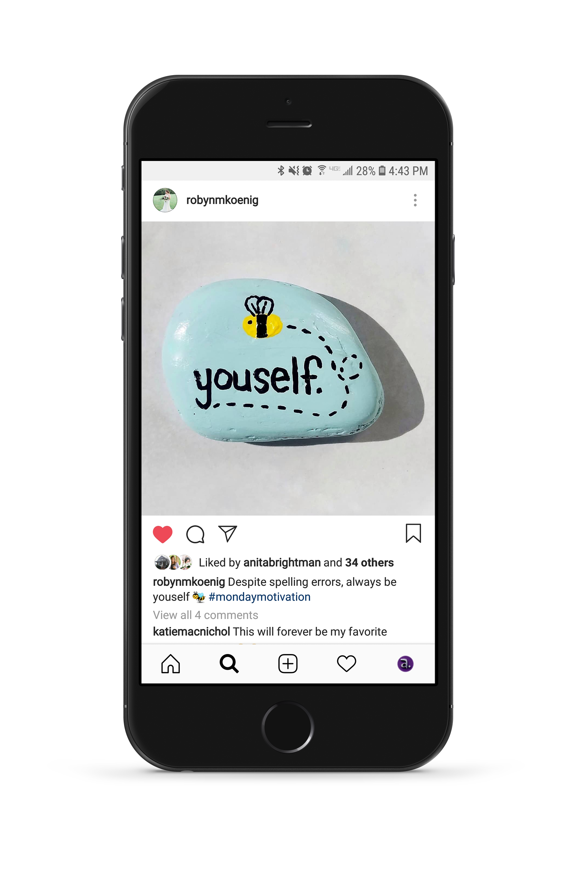
First and foremost, always determine your audience and get to know them. It may seem rudimentary, but I can’t tell you how often that gets skipped. Misalignment of verbal and visual messaging or speaking to the wrong audience causes a campaign to fall on deaf ears. One of our main goals is to create a bond with the audience member and try to make that person a brand ambassador. If what we say isn’t clear, we’ve missed that opportunity.

You’re a big hockey fan, yeah?
Yes, I am indeed!

Okay, so, here’s a curveball question: What can the average person learn about creative strategy by watching hockey?
I thought this question was going to be a tricky one. This brings up one of the other major principles of brand development, or all design really, which is consistency. The fundamental mechanics of hockey—skating, passing, shooting, etc.—need to be consistent. They become muscle memory for players. Once your fundamentals are strong (and consistent), it frees you up to exercise your creativity. It’s the same for design, if you have a solid process in place to dissect the situation, you can focus on the fun part of exploring new and creative solutions whether along the boards or on a billboard.

That hockey analogy is also useful for another thing that has been consistent throughout my career: situational awareness. No matter how well you know the audience, your team always needs to consider special circumstances and other factors influencing decisions.

I’d say this is one of the cooler things about design. Even if the end goal of two projects is categorically the same, the results will look different because of the details such as audience, preferences, budget, etc. This is what makes what we do fun and usually challenging but never boring.

What’s one thing in all the design work you’ve done that stuck with you?
In one of my first design jobs out of college, I learned how important it is to be able to distill the essence of a company or organization into something visual that conveys meaning at a glance. And, at the same time, I also learned that you absolutely need to disassociate your ego from your design (work). Looking at it objectively will help you remove your personal bias, hopefully making it easier to explore fresh ways to approach your work in general.

What exercises do you use with the visual team to build a brand identity?
Well, for me, the visual side of branding starts with words, ironically. We brainstorm words that can represent the essence of the client, its mission, products, values, etc., to set a direction. It’s basically a word association game we play together. It gets everyone thinking about the brand and helps make that “blank” sheet of paper that we all must start with a little less intimidating.

In the context of design strategy, what does “staying on the cutting edge” mean to you?
It’s a double-edged sword. Technology and technique-wise, our team always stays at the forefront. From a design perspective, though, it’s sometimes best not to be too edgy. If your client is an investment bank, it’s probably wise to convey a slow-and-steady, trustworthy identity. Again, it all comes down to your audience and their needs.

What have you learned while working at A. Bright Idea?
Working with this fantastic team has helped me stabilize my process. Projects change, and over the years so has technology. But A. Bright Idea is a believer in process. I appreciate our methodical, strategic approach to finding alternative solutions to design needs. And although I still use everything I’ve learned in my career up to this point, one of the great things is that no two projects are ever the same. So we always have opportunities to learn and explore our creativity.

Connect with us to gain more insights from Brian and others on our team by emailing info@abrightideaonline.com.

An infographic is a term for graphic visual representations of information intended to be understood quickly and clearly. These graphics enhance the reader’s ability to see patterns and trends.

Graphic depictions of concepts have been integral to human communication since our earliest days. Think about it: there are cave paintings and stone etchings dating back to 40,000 BCE. What’s more, these graphics still convey powerful messages to this day about the lives of our prehistoric ancestors.

What separates a good infographic from the rest?

To start, it might be easiest to define a “poor” infographic. A poor infographic does not effectively communicate the story behind its data, usually through a lack of intentional design.

Here is an example of an infographic intentionally made by our visual team to illustrate these points. Note the overall lack of intent when it comes to design.

What kind of information is best suited for an infographic?

According to our Senior Graphic Design Specialist, Robyn Koenig, quantitative or numerical information is best suited for infographics as it can be easily visually represented without the need for wordy explanation. Types of quantitative information include:

  • Ratios and percentages
  • Statistics and probability
  • Change over time
  • Change across groups

It’s important to note that certain specialized infographics do not include any quantitative information. Such infographics may include factual statements or instructions for a process.

Information not suited for an infographic includes narrative, opinions or complex data that requires significant explanation to be understood.

Here’s how to make the biggest impact

Firstly, and most importantly, make sure to have a hierarchy of information baked into the infographic. Make sure the most important information is prominent, with supporting information discernible but not distracting from the main message.

Don’t overdesign: maintain a consistent style while limiting the number of typefaces and leaving space for the eye to rest. Too much busyness can fatigue the reader and make the information less impactful.

However, make sure to create a brand identity through an intentional color palette and design style. When you relate the style to the subject matter, it contextualizes the information and makes it easier to understand.

Select graphs and graphics that make sense with the information you are trying to convey. Certain types of data or information call for particular graphic representations.

For example, use a pie graph to show the proportions of a whole, bar graphs to show group differences or line graphs to show change over time. Using the wrong graph to depict your information will seriously inhibit its impact and legibility.

How style shapes substance

What overall styles for infographics are the most effective? The answer is: it depends on your audience.

Think about it: children wouldn’t respond as well to a minimalist, industrial design as would a business professional in their mid-late 50s. Children, by contrast, prefer to look at highly colorful, engaging designs and understand simple, stylized graphics.

When to use infographics

The potential usage of infographics is nearly limitless, although they have their time and place. It is important to note that there are several types of infographics, each suited to communicate different messages. Therefore, the type of infographic determines its best usage.

Infographics are indispensable tools for putting information in context for a particular target audience and emphasizing trends (be careful not to misrepresent data, though.)

Here is a sample infographic put together by our design team here at A. Bright Idea.

Find out more about our graphics team here.

For many, the first step into your industry-of-choice starts with an internship. In preparation for this “real world” introduction, take the following steps to earn your graphic design internship.

  1. Research the company
  2. Be yourself
  3. Bring a portfolio
  4. Talk through your process
  5. Send a thank you note

After selecting companies you feel fit your creative spirit and career aspirations, pour your passion into crafting a perfect cover letter and resume, remain diligent about following up with prospective employers, answer every phone call and monitor email to ensure you don’t miss out on the opportunity for an interview. Then, after all the waiting — and let’s be honest, some stress — you receive the call offering an interview for the design internship of your dreams! So, what do you do now to prepare?

1. Research the company

Now that the interview is scheduled and placed on your calendar (hint, hint!), the first thing you should do is research the company, in detail, if you haven’t already. Read about how the company started, make note of the leadership, research their company culture, list of clients and portfolio of work. This initial step will help when the employer asks, and they will ask, “Why are you interested in a design internship with us?” You will demonstrate that you took the initiative to research and familiarize yourself with their company.


2. Be yourself

This one tops the list for any interview, but it’s true. Most people get a case of the nerves during any interview, so you are not alone if you feel anxious the day-of. Take a few deep breaths, try to stay relaxed and just be yourself. Employers want to see the real you. Not only do employers look to see if your skillsets are up to par, but they also take into consideration how you fit into their culture. Have personality during the interview and show the company why you’d be a great extension of their team.

3. Bring a portfolio

When interviewing for a graphic design internship, make sure you bring a professional and polished portfolio in digital and/or print versions. If you designed a website, bring an iPad or laptop with you to the interview so you can walk through the site — do not rely on the interviewer to supply the technology. If you designed a printed piece, bring a mock-up so you can talk through your design process from conception to implementation. An equally important second part to this step — take pride in your work. As you talk through your portfolio with the interviewer, speak with confidence about the things you created. Do not mention what you should have done or would have done. Talk about your pieces in a positive light and focus on things you did well in the execution, or how you solved the design problem.

4. Talk through your process

While your portfolio shows the interviewer the end-product of your creativity, it does not convey the story behind your creative genius. Start with explaining the project or assignment to show your understanding of the audience and design problem. Demonstrate your critical and design thinking by answering the following questions:

  • What challenges did the project present and how did you solve them?
  • Did you work within a budget or time constraints?
  • What was your strategic approach?

As you explain, take ownership of the project and the design decisions you made along the way. Describe your purposeful design choices that influenced your decisions and the strategy behind them. Please know, graphic design professionals do not want to hear you did something “because it was pretty.”

5. Send a thank you note

After you make it through the interview — and, you will definitely make it through — be sure to send a thank you note to the interviewers. This may seem like an outdated gesture, but a handwritten thank you note speaks volumes. Take the opportunity to thank them once again for their time and consideration and to express your interest in interning with their company. Not to mention, it will help you stay fresh in their minds as they make their decision.

Making the best impression during your interview requires preparation. While you’re there to try and land an internship, you could also be speaking with your future full-time employer. Take the necessary steps to impress before and after the interview, and always remember to be yourself.

Stay connected with A. Bright Idea by checking the careers section on our website for any future employment or internship opportunities.

“Design is where science and art break even,” said Designer and Entrepreneur Robin Mathew. Most people don’t recognize a correlation between science, technology, engineering, and math as they relate to art, but at A. Bright Idea, we certainly do.

Digital Canvas

It might surprise you to know just how much technology goes into graphic design. Throughout a whole workday, technology gets used to establish creative to bring brands and advertisements to life. No longer solely centered around creating a piece of art, a graphic designer’s strategy now includes a focus on functionality and how their work will succeed in the digital world.

Users can now access online information via desktop, mobile or tablet surfaces. With a change in user experience comes a shift in design strategy. Responsive design, for example, involves creating a website to work on large horizontal desktops as well as a small portrait phone. Designers must keep this in mind during the development process to ensure any text, graphics or videos will function properly no matter the source.

By committing to life-long learning, designers and artists can smoothly transition as technology continues to evolve, thus becoming artistic and creative in a digital and technological sense.

Modern Paintbrush

Just as Leonardo da Vinci found common ground between science and art, so do contemporary graphic designers. A computer, in turn, becomes the paintbrush.

Technology provided the fuel for art to not only evolve but come to life with a direct purpose that integrates directly into everyday life. Whenever you see a logo for a company or a design on a website, you witness art in a digital form.

For the most part, graphic designers start out with a sketch of an idea before turning to technology to elevate it to the next level. Software suites, like Adobe Creative Cloud, allow graphic designers to easily transition from sketch to vector — digital images created by placing lines and shapes in a given two-dimensional space — arrange pages of a brochure or create custom animations. When designers use this software to enable creative freedom, the technological and artistic worlds collide.

Unexpected Inspiration

Creative inspiration can stem from anywhere. Designers use math and science for concept inspiration, as well as product execution. Math allows designers to create crisp and accurate graphics. Simple, yet important things like measuring out the sides of a brochure or making sure lines run precisely parallel to each other make designs as perfect and functional as possible. Designers also use math to scale images, convert units, write print specifications and develop deadlines for printed projects.

Geometry acts as a building block for many different designs, such as creating icons and graphics to then use in making complete shapes. It seems like a simple concept, but designers more often than not use shapes to create a complete image, not free-hand drawings. For example, designers can create a light bulb through the use of geometry by setting various shapes at different angles and placements. This method requires a meticulous approach, bringing several different variables together to create an end product.

With so many variables to work through and consider, problem-solving becomes an essential part of a graphic designers’ process. When an engineer gets tasked with building a bridge, key components to consider include the quantity and cost of materials needed. Similarly, when designing a brochure, graphic designers also consider size and shape, materials, cost efficiencies and other variables to ensure a complete and functional final product.

Creativity and technology not only coexist but also produce groundbreaking ideas and outcomes. Art not only fits perfectly into science, technology, engineering and math, but creates a connection among all of them. Strategy and technicality have no limit when it comes to various industries. An engineer exudes the creativity of an artist, just as an artist emanates the innovation of an engineer.

Marketing businesses using Facebook and Twitter has become a growing tactic in marketing plans across all industries. Social media platforms serve as an effective tool for circulating branded messaging, but Internet usage and trends continue to change every day.
In a recent article, Bulldog Reporter found that 90% of all Internet traffic and 50% of mobile traffic is now made up of photos and video. For growing visual media platforms like Instagram and Pinterest, this means an opportunity for continued expansion. Instagram’s more than 200 million users make up an attractive market of young people for PR and marketers. Digital media reporting site Mashable has also found that 1 in 5 U.S. adults are now using Pinterest. These large groups of users of both platforms are at the ready to receive visual content that could ultimately lead to better connecting and capitalizing on consumer and brand relationships.
With the expanding use of visual media, it is more important than ever to control your brand’s messaging. People make decisions based on trust and brand promise. Using photos and visuals helps create another tangible connection to brands. As we can see from these recent statistics, it is becoming a greater means of communication – that old adage “a picture’s worth a thousand words.” Having a strategic presence in visual media can serve as a key tool to further brand development as part of an integrated marketing approach. Everything you do or say influences what people think about your brand, so providing them with a visual example of what your brand promises also helps demonstrate that your brand delivers on this promise.
No matter the medium, the ability to connect users with your brand is crucial to developing brand loyalty, and will ultimately lead to a better consumer experience. It’s important to assess your own brand strategy as it compares to trends, as not all trends serve brands equally. With the expanding use of visual media, now is an opportune time to analyze your own brand and consider the most strategic uses of visual media and how it can potentially become part of your integrated marketing approach.