
An infographic is a term for graphic visual representations of information intended to be understood quickly and clearly. These graphics enhance the reader’s ability to see patterns and trends.
Graphic depictions of concepts have been integral to human communication since our earliest days. Think about it: there are cave paintings and stone etchings dating back to 40,000 BCE. What’s more, these graphics still convey powerful messages to this day about the lives of our prehistoric ancestors.

What separates a good infographic from the rest?
To start, it might be easiest to define a “poor” infographic. A poor infographic does not effectively communicate the story behind its data, usually through a lack of intentional design.
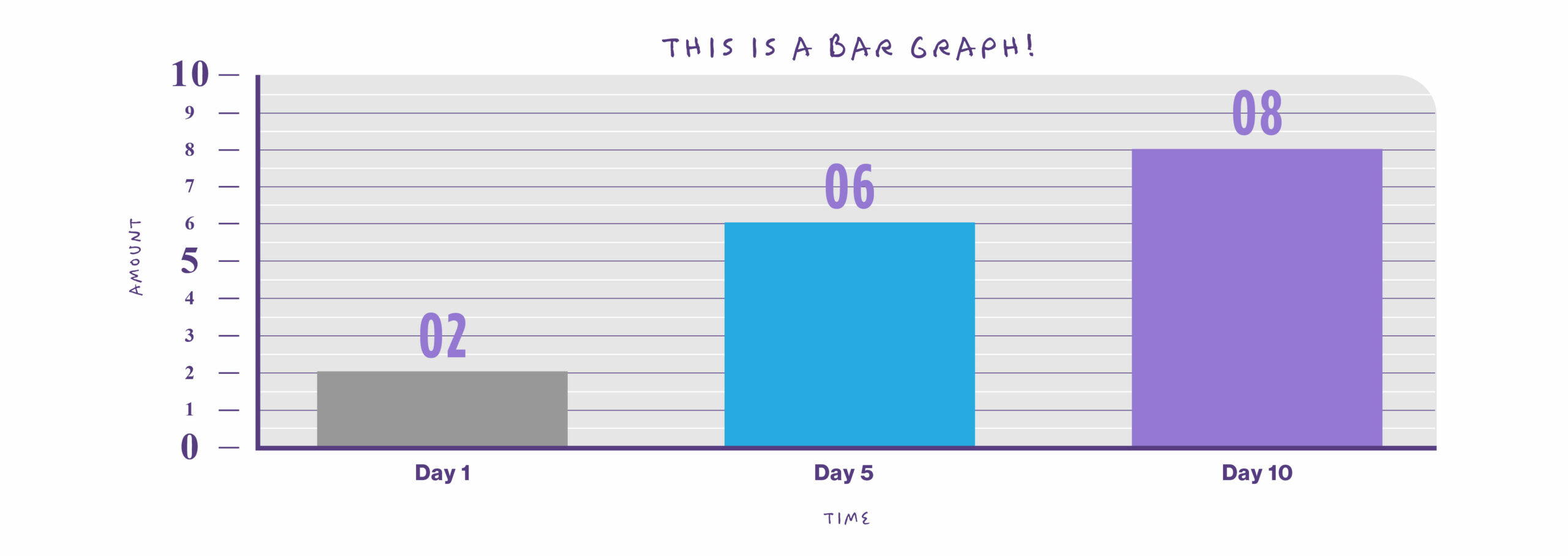
Here is an example of an infographic intentionally made by our visual team to illustrate these points. Note the overall lack of intent when it comes to design.
What kind of information is best suited for an infographic?
According to our Senior Graphic Design Specialist, Robyn Koenig, quantitative or numerical information is best suited for infographics as it can be easily visually represented without the need for wordy explanation. Types of quantitative information include:
- Ratios and percentages
- Statistics and probability
- Change over time
- Change across groups
It’s important to note that certain specialized infographics do not include any quantitative information. Such infographics may include factual statements or instructions for a process.
Information not suited for an infographic includes narrative, opinions or complex data that requires significant explanation to be understood.
Here’s how to make the biggest impact
Firstly, and most importantly, make sure to have a hierarchy of information baked into the infographic. Make sure the most important information is prominent, with supporting information discernible but not distracting from the main message.
Don’t overdesign: maintain a consistent style while limiting the number of typefaces and leaving space for the eye to rest. Too much busyness can fatigue the reader and make the information less impactful.
However, make sure to create a brand identity through an intentional color palette and design style. When you relate the style to the subject matter, it contextualizes the information and makes it easier to understand.
Select graphs and graphics that make sense with the information you are trying to convey. Certain types of data or information call for particular graphic representations.
For example, use a pie graph to show the proportions of a whole, bar graphs to show group differences or line graphs to show change over time. Using the wrong graph to depict your information will seriously inhibit its impact and legibility.
How style shapes substance
What overall styles for infographics are the most effective? The answer is: it depends on your audience.
Think about it: children wouldn’t respond as well to a minimalist, industrial design as would a business professional in their mid-late 50s. Children, by contrast, prefer to look at highly colorful, engaging designs and understand simple, stylized graphics.
When to use infographics
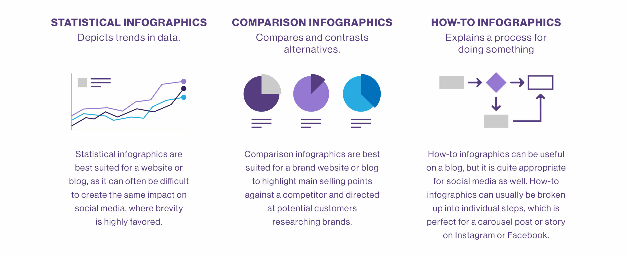
The potential usage of infographics is nearly limitless, although they have their time and place. It is important to note that there are several types of infographics, each suited to communicate different messages. Therefore, the type of infographic determines its best usage.
Infographics are indispensable tools for putting information in context for a particular target audience and emphasizing trends (be careful not to misrepresent data, though.)
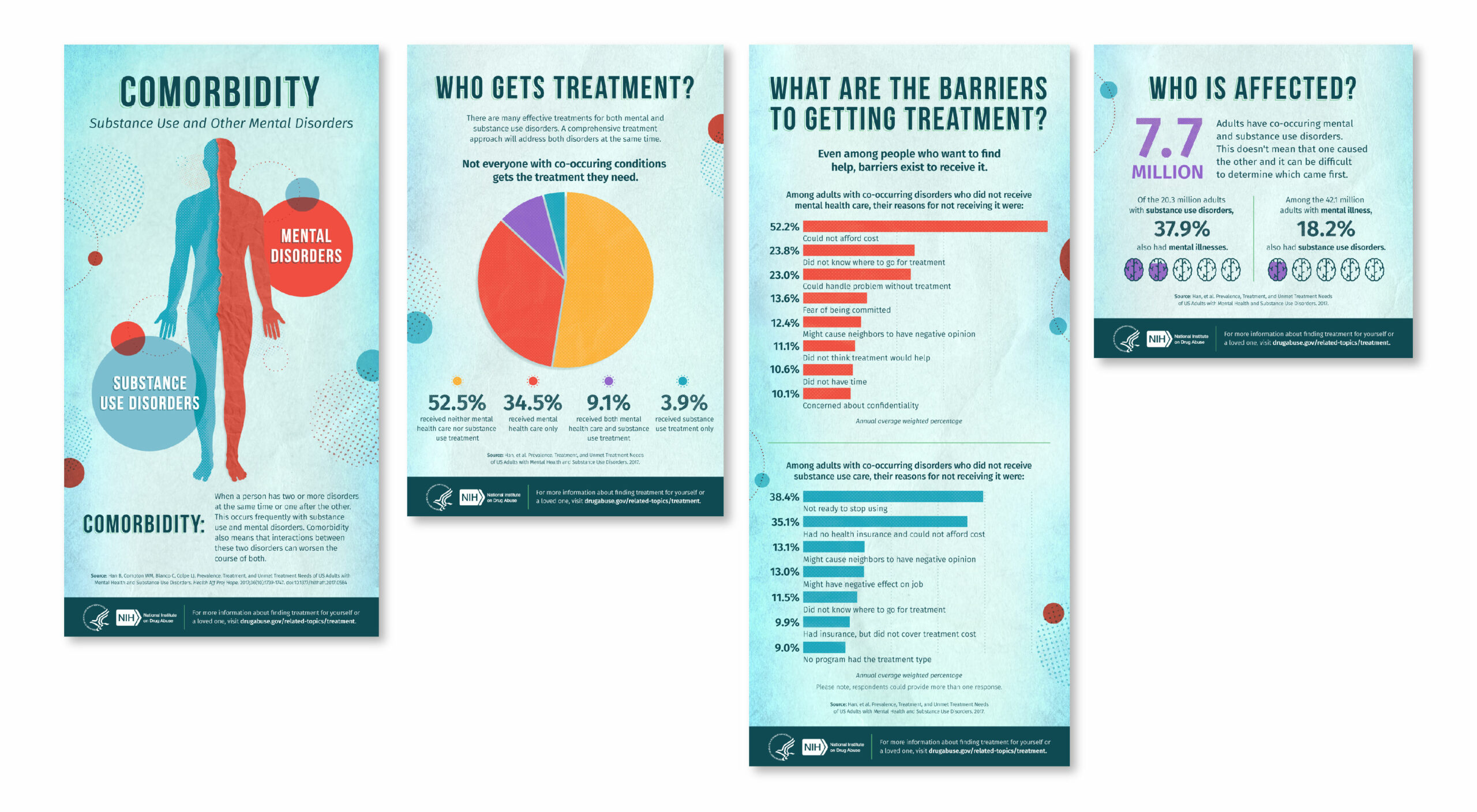
Here is a sample infographic put together by our design team here at A. Bright Idea.
Find out more about our graphics team here.